How to Instantly Improve Your Website Navigation
 Confusing navigation will literally ruin your website.
It matters that much. If a visitor can’t get around easily, you’ve got them thinking all the wrong things: “What does this button mean? Oh, I see. Wow, that doesn’t quite make sense…” instead of “Oh, this service looks interesting…Maybe just what I was looking for, actually…”
Bad navigation not only lessons the chances of a visitor finding what they want. It completely takes them out of the moment.
So how do we fix existing problems? Website navigation is much more than just the row of links at the top of every page, but that’s an important element. So let’s start up there.
1. Reduce the number of options.
The fewer items in your top website navigation…the better.* There’s a well-known study by Sheena Iyengar that demonstrates this idea very clearly. Researchers set up a station in a grocery store with a variety of interesting jelly samples. Over the course of the day, there were periods when they offered six jelly options. There were also periods when they offered twenty-four jelly options.
Not surprisingly, a higher percentage of customers were lured by the larger display (60%) than the smaller one (40%). BUT…who actually bought jelly?
Only 3% purchased jelly after sampling from the display of twenty-four. Yet 30% purchased jelly after sampling from the display of six. We all think we want a lot of choices, but really…we don’t. Too many choices lead to no decision at all. When it comes to your website, you want your visitor to choose an option in the menu and click. You want them to buy the jelly.
*Ok, maybe not literally “the fewer the better”. No less than three. One or two would be weird.
2. Reduce the number of options. (Part 2!)
Have you ever been to website that has too many items in the top navigation? Visually, it’s a bit of a nightmare. (The worst case scenario is when it goes to two rows. The worst.) So, assuming you have some information to share on your website, where does it all go?
Sensible Drop-Down Menus
And by “sensible”, we mean your user will find things in those drop-downs that make sense. For example, an author’s website may have a top navigation that contains the following: Home, About, Books, Contact.
What’s under “Books”? Not contact information. Not a bio. This is the place to access pages about each of her books. It’s a simple example and these decisions can get much more difficult than that, but the idea is to try not to surprise anyone. Do the expected.
There are some who would argue against the very existence of drop-down menus. I’ve seen it as formal advice: “Don’t use drop-downs.” But I would advise you to absolutely use them when necessary (which happens a lot) and just make sure the drop-down is not the ONLY place to access the pages in question. You can’t assume that your visitor will hover over those buttons, so give them other chances to discover that content.
Using this site as an example, a visitor can find our website and logo design packages by hovering over the Services link in the top navigation. But if they end up on the Services page by clicking on some other button…there’s another big chance to find those two packages. Click here to see what I mean. (Ah! I tricked you into looking at our offerings! I hope you don’t feel manipulated.)
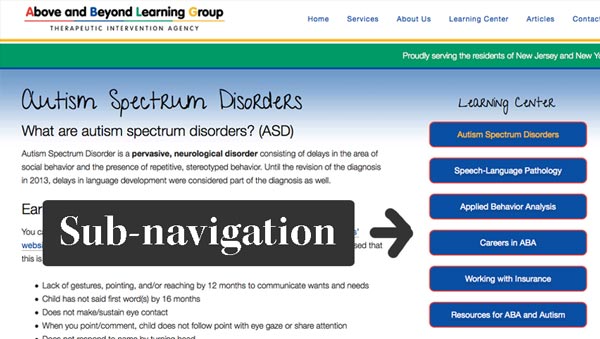
Sub-Navigation
Let’s use our author example again. If the visitor clicks on one of the “Book” links in the top-level navigation, they’ll be taken to that page. But wouldn’t it be nice if we made it even easier to click around to different books once we got there? A sub-menu will show them a list of options right on the page. Two examples:
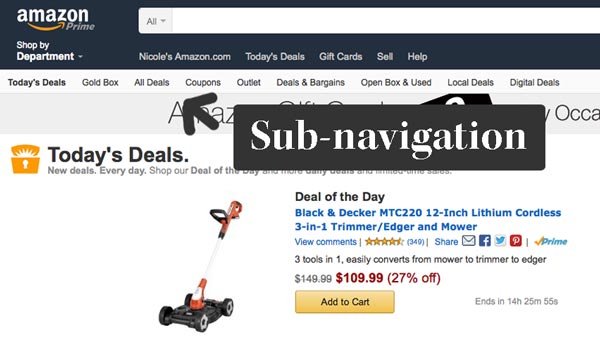
On Amazon.com, I clicked on “Today’s Deals” in the top navigation…and the “Today’s Deals” sub-menu appeared underneath it. It contains a whole bunch of options related to that category and I’ll continue to see that menu as long as I stay within the “Today’s Deals” section.
The second example is from the site of one of my clients. We created a “Learning Center” within the site, so the visitor sees this sub-navigation no matter where they are within the Learning Center. This is done by creating a custom menu and placing it in the sidebar on only the relevant pages. Both of these examples make things easier for the visitor.
Edit
Another thing to remember? Not everything has to go in the navigation. Sometimes it just makes sense to lead your user down a digital path, rather than putting it all out there.
3. Use action words.
A study in 2014 (direct link no longer available) found that navigational links that take the form of an action “enhance usability”. Users were able to complete tasks faster and with better accuracy when the site navigation was action-oriented. And although this study was specifically about older users on a community college website, I’m thinking we can all benefit from the message. Keep phrases action or goal-oriented when possible.
Examples: You may want to choose “Work with Me” over “Services” because it’s about action, but do what feels right. Back when the bottom of this website was formatted a little differently, we changed the wording on each of the headings in our website footer. “Articles” became “Read an Article”. “Pages” became “Browse Other Pages”. Sometimes action-oriented words feel better.
Do this when it makes sense for your site and don’t take it too literally. In other words, “Home” is vastly better than “Visit the Home Page”. And this is because of perhaps the most important tip…
4. Do what everyone else is doing.
Use standard naming conventions on things that are well-established like “Home” and “About”. Sure, you can sass things up a little (About Us), but don’t get crazy. We’re looking for quick recognition followed by action. Not “What does she mean by that?” followed by furrowed brow followed by clicking on a random link followed by going to another website.
There are endless ways to get creative with your branding, offerings, and content. Keep things deeply uncreative in the navigation.
5. Remember who you’re talking to.
(Should I be saying, “Remember to whom you are speaking?”) No technical terms or industry-specific jargon unless your audience speaks that language fluently. So, if you’re a coach, don’t use terms you learned in coaching school unless your audience is other coaches.
5. Include your main call to action.
If you want visitors to “Book a Call” or “Sign Up”, give that action a place of honor in the navigation. And you can take things a step further by visually highlighting it. Try adding a background color behind just that link and placing it last on the list.

Why last? Two reasons: 1. If you’re highlighting just one link in the navigation, it will look weird in the middle of the list. 2. The concept of serial positioning, which states that people remember items at the beginning and end of lists. Your main call to action is something that they should see, remember and (at some point during the website visit) click.
Most of that is pretty easy to implement, right?
If you found this helpful, share it.
If you’ve been moved to make some kind of change to your navigation or have a different opinion on one of these suggestions, I’d love to hear about it in the comments.


Kat Bern | Dream Home Creator
| 19 April 2015Awesome article! I am thinking of including more pages into my website, but I’ll be definitely thinking about the drop downs.
But it got me thinking – how does a drop-down menu work on mobile? I guess I’ll need to test that first 🙂
curioelectro
| 20 April 2015Any decent theme these days will have a method to handle drop-downs on a phone with no problem. But as always with mobile…test, test, test. Try it on your own phone. And, to know how your site looks on EVERYTHING, try Browserstack. They have a free trial.