
How to Find Unique Color Schemes
We’re all in constant danger of falling into a color scheme rut.
I, for example, have a thing for periwinkle. But this isn’t Periwinkle Electro (…where all websites are mostly periwinkle!), so I have to look outside of myself for inspiration. Fortunately there’s a specific method for finding it.
I’m a web designer, which means the last places I should look for unique color schemes would be…other websites.
Keep things interesting by looking to other forms of art and design. This could mean photography, painting, fashion illustration, sculpture, or comic books. It doesn’t matter, as long as it sparks something.
The key is to look outside of your own field. That’s where the new ideas live.
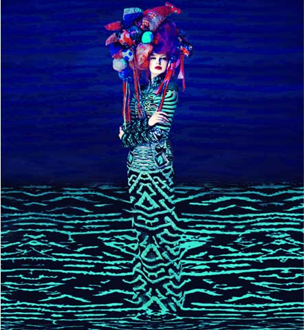
In other words, if you’re an interior designer you could get fresh color inspiration from, let’s say, the surrealist fashion of Mary Katrantzou and Erik Madigan Heck.

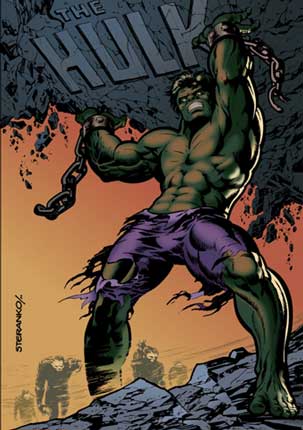
If you’re a surrealist fashion designer (please let a surrealist fashion designer be reading this so we can eventually be friends), maybe you’re getting bolts of inspiration from the color schemes that were created by comic book artist Jim Steranko.
And if you’re a comic book artist, maybe something subtle like The Kabalistic Stations Outside the House by Y[u]G : Y[o]G : Y[i]G will help you start to think out of the typical comic book box.
![The Kabalistic Stations Outside the House Y[u]G : Y[o]G : Y[i]G](https://curioelectro.com/wp-content/uploads/2014/07/soft-image.jpg)
Where can you collect these images?
If there is a perfect use for Pinterest, this is it. I have a color scheme board where I snap up any image with a color scheme that grabs my attention. This is an image from a listing on Etsy for heirloom carrot seeds:

I know. It’s amazing. If you garden, go buy the seeds here.
Fabulous. Then what?
There is a second step to this process. A painting or photograph has hundreds (thousands? millions?) of colors and you’ll need to pull from those to create an actual, working color scheme. Your method will depend on your preferences and field of design, but here are some options:
Using Photoshop, Illustrator or Gimp (basically a free, open source version of Photoshop)
Import the image into a new document and then draw four or five little rectangles next to it. Use the eyedropper tool to start pulling the colors that most appeal to you from the image and dropping them into the rectangles. Look for contrast. Try including the very lightest and the very darkest shades in your collection. Also try including two variations on one color in the collection. See how that looks. Experiment until your little collection looks good all on its own — whether the image is there or not.
Using paint chips
Start pulling colors from the image using corresponding paint chips from a hardware store or, if you’re an interior designer, the ones you have in your office. Begin with the most prominent color, the lightest, the darkest, your favorite, etc. And keep experimenting until you have four or five that look amazing together in your hand.
Using a web-based eye-dropper tool
To work directly from an image on the web, use a color picker extension for your browser. It will allow you to select any color from the screen using an eyedropper tool, then get the specific color value (usually in a six digit hex number) so you can reproduce it elsewhere. There are a ton of options for color picking extensions. I like Rainbow Color Tools for Firefox, but I’ve also used Eye Dropper for Chrome.
And here’s an example of a finished color scheme:
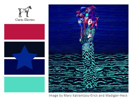
This was created from the image at the top of the page. You don’t have to be so formal about laying it out. I clearly can’t help myself.
So do you have a particular source of inspiration for your color schemes? It’s an interesting topic and I’d love to hear your thoughts in the comments.


TIffany
| 24 July 2014This is so helpful! I love the idea of using the eyedropper tool to pull appealing colors. Thanks for the inspiration.
Suzi
| 24 July 2014Great post! I love using the Adobe Kuler app on my phone- you can take pictures of the world around you, and it spits out a color pallet.
Michelle
| 24 July 2014I love Adobe Kuler and didn’t know about the app. So thanks…!
curioelectro
| 24 July 2014Yes! The Adobe Kuler app is cool.
Erin E Flynn
| 24 July 2014Love this! I think branching out to different sources is so much more inspiring! =D
Siedah Mitchum Designs
| 24 July 2014Great share. I had to bookmark this page for reference. I absolutely love doing mood board, but going more into color scheme is great reference not only for us but the client.
Madeleine
| 24 July 2014Super fresh ideas, love them all! I can totally relate that it’s important to look outside your industry. Websites are cool, but it’s easy to become too repetitive if we search for color inspiration only on the internet.
Kirsty
| 24 July 2014This is a good reminder, it can be too easy to just look at other design for inspiration sometimes!
Nat, Website Superhero
| 24 July 2014I loooove this idea. And impressionist and surrealist art. Bingo!
Nicole
| 25 July 2014I totally feel you! If it was up to me, my entire home would be teal! Love your tips 🙂
Tracey
| 25 July 2014Seriously, this is fantastic. I love this post and you.
curioelectro
| 26 July 2014Tracey! Thanks, lady:)