
Interior Design as Web Design Inspiration: The Bold Blue Study
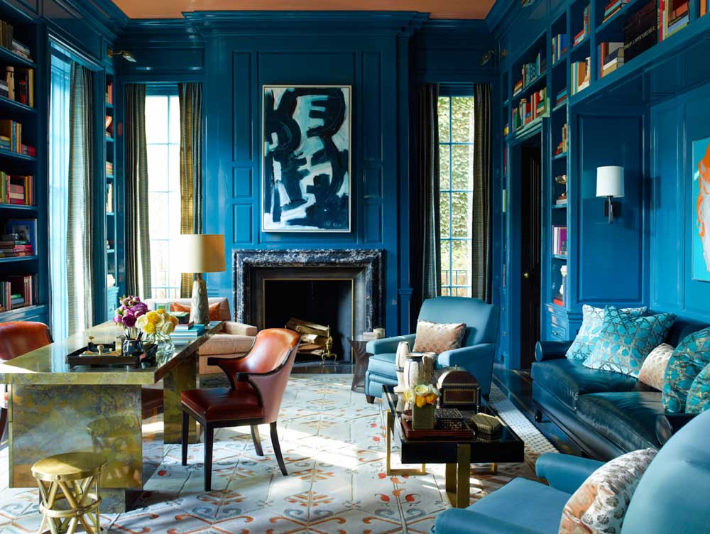
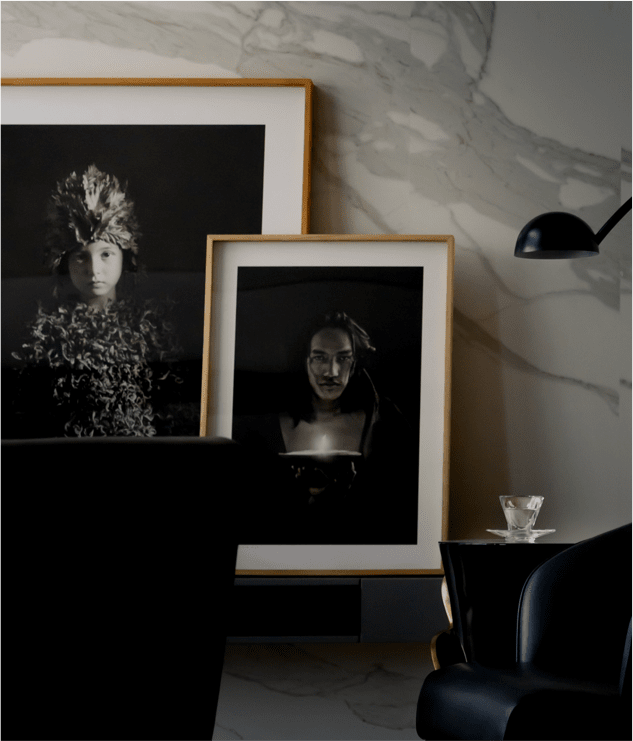
When using an interior design image for web design inspiration, we have to look at more than just the color scheme.
This is about digging around a little. What repeating shapes do we see? Is everything rounded, solidly squared off, or somewhere in between? How does the image feel? Silly? Classic? Sad? Bright and perky? Is there a pattern that could be useful? A motif like the roses in the Beach Style post? I chose interiors for this series because you’ll always find thoughtfully placed texture, color, pattern in a well-designed room. It’s an inspiration gold mine.
So what if we were inspired not just by the color scheme in this room, but also the attitude about the color scheme?
Because this design has a distinct point of view: Blue is not an accent color. It’s everything. And sometimes, when putting together something really elegant, you can’t be shy.
So if we are to imagine a web design inspired by this image, it would clearly need a deep blue background. The big text headings—also in blue. (Remember, blue is everything.) The social media icons, buttons and body copy would be layered over the background in something much more subdued than white. And the font would need to feel classic. This is not the time for hand-written scripts or big, curvy letters. It’s about elegance, color and a little bit of pattern.
Color Palette
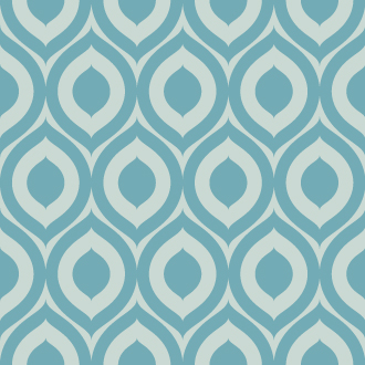
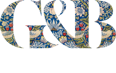
Pattern
Headings
This is a heading.
Font: Kepler Display
Body Copy
This is what body text would look like. This is what body text would look like. This is what body text would look like.
Font: Aktiv Grotesk Std
Social Media Buttons
Regular

On Hover

Image Treatment
What kind of website could use a design like this?
Well, it would have to be one that focuses on big, beautiful images and doesn’t have a ton of text. Long paragraphs of light text on a dark background are simply not as easy to read. Perhaps a portfolio site or one that sells a high-end product?
And what do you think?
What you notice in this image and use for inspiration might be completely different than what I see. Would you style things differently?
Do you have a room in your portfolio that could inspire some digital design? Drop me a note. I’d love to feature your work in this series.

Carmen
| 14 April 2020I just want to know what color blue this is. I bought some blue for my bathroom and it just seems too dark. I love how pretty this blue is.